When creating an attribute, you have several options on the Attribute Details page for the way you want it to display and collect information. With so many options, sometimes it can be easy to get confused as to what each one is. So we’ve made it easy for you with simple descriptions below!
Display Types
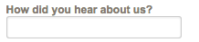
Text box
Single line allowing a user to input their own custom value
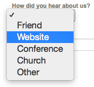
Combo box
Drop down selection, requiring you choose from a list of options. Once selected, the list of options is no longer displayed, unless you expand the list from the drop down arrow again
Combo list
Exactly like the “combo box” except as you type a value, it will pull from the possible results
Check box
A single check box that can be selected (useful for true/false, yes/no, etc)
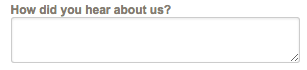
Text Box MultiLine
A text box with multiple lines allowing more space for a custom response. Users can input up to a maximum of 6,000 characters.
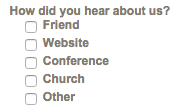
Checklist
Displays a list of options to select by checking the box. Allows for multiple selections.
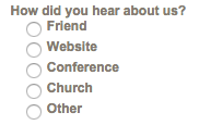
Radio button list
Displays multiple options with the ability to only select one
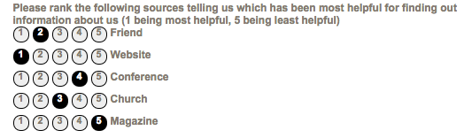
Rank
Ranking options from highest to lowest, favorite to least favorite, etc. Cannot rank 2 options the same value
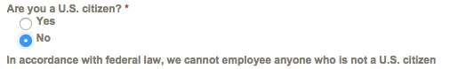
Label
Able to display information to users, instead of collecting. Can be helpful when using conditional logic (ie: Staff Attribute 1-“Are you a U.S. citizen?” If the answer is no, then the Label attribute might say “In accordance with federal law, we cannot employ anyone who is not a U.S. citizen”)
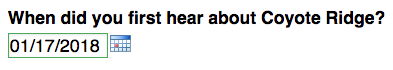
Date Picker
Display an option for the the user to select a date. Date can be viewed in CT5, but not edited.